

A sage sweater that looks dull on the hanger can make one face look rested and even, while a crisp white shirt that looks fresh on everyone else makes the same face look tired. That is the soft autumn color palette at work. Soft autumn coloring is gentle and earthy, so colors that are muted and a little warm blend with it, and bright or icy colors overpower it. Below are all 30 colors in our soft autumn palette, with names and hex codes, plus neutrals, metals, makeup, hair and the shades to keep away from your face.
The soft autumn color palette is a set of muted, warm-leaning, medium-depth colors: moss, sage, faded denim, soft teal, cinnamon, soft coral, muted terracotta, honey wheat and soft brown. It suits low-contrast coloring with a slight golden lean. The palette avoids black, bright white and vivid, cool colors like hot pink and cobalt.
What is the soft autumn color palette?
Soft Autumn is the muted, warm-leaning member of the Autumn family. Its colors are soft first and warm second, with medium depth and low contrast. Think of a landscape seen through light mist: green fields, faded denim sky, dried leaves and wheat, with nothing glaring.
Our soft autumn color palette has four groups. Six best colors for everyday wear, six accents to add variety, six neutrals to build a wardrobe on, and eight colors to wear sparingly.
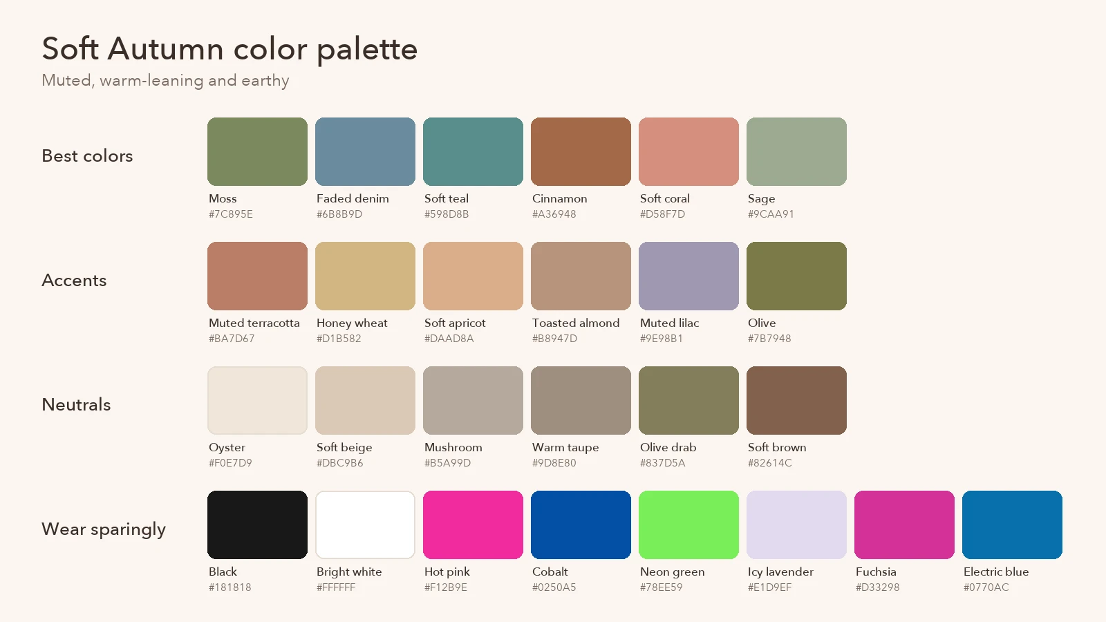
Best colors
| Color | Hex | How to wear it |
|---|---|---|
| Moss | #7C895E | Knitwear, jackets, everyday tops |
| Faded denim | #6B8B9D | Shirts, dresses, your blue in place of navy |
| Soft teal | #598D8B | Blouses, scarves, statement coats |
| Cinnamon | #A36948 | Sweaters, suede, leather accessories |
| Soft coral | #D58F7D | Summer tops, dresses, lip color |
| Sage | #9CAA91 | Tees, linen, loungewear |
Accents
| Color | Hex | How to wear it |
|---|---|---|
| Muted terracotta | #BA7D67 | Prints, skirts, blush tones |
| Honey wheat | #D1B582 | Light layers, a softer stand-in for mustard |
| Soft apricot | #DAAD8A | Spring and summer tops |
| Toasted almond | #B8947D | Knits, trousers, bags |
| Muted lilac | #9E98B1 | The palette’s one cool-ish note, good in prints |
| Olive | #7B7948 | Cargo trousers, utility jackets, skirts |
The palette is built from three traits. Hue sits on the warm side, lightness stays in the middle, and color intensity is low. Those are the same three properties the Munsell color system uses to describe any color: hue, value (lightness) and chroma (color intensity). Soft Autumn is defined mainly by low chroma, which is why every shade in it looks slightly grayed.
How do you know if you’re a soft autumn?
Soft autumns tend to share a few traits. None of them alone decides the season, but together they point toward it:
- Low contrast. Hair, skin and eyes sit close together in depth, with no striking dark-against-light effect.
- Soft golden or ash-brown hair. Often a dark blonde to medium brown with a mix of warm and slightly ashy strands.
- Hazel, green or soft brown eyes. Eyes with several blended colors and a gentle, rather than sparkling, look.
- A warm lean, not a strong one. Gold usually flatters a little more than silver, but very orange or very golden colors can still look heavy.
- Bright colors look loud. Hot pink, cobalt or bright white seem to arrive before you do.
The most reliable test is comparison. Hold a muted color and a bright version of it under your chin in daylight, such as sage against lime green or soft coral against hot pink. On a soft autumn, the muted one makes the skin look smoother and the eyes clearer, and the bright one draws attention away from the face. Then compare a warm muted color with a cool muted one, like cinnamon against dusty mauve, to check the warm lean.
Our free seasonal color analysis runs both checks for you. It reads a selfie in your browser, so the photo stays on your device, and matches you against all 12 seasons. If you’d rather skip the photo, an eight-question quiz gives you a season too, and a virtual draping step lets you compare colors under your chin to fine-tune the result.
Best neutrals and metals for soft autumn
The neutrals in the soft autumn color palette carry most of a wardrobe, so getting them right matters more than any single bright piece.
| Neutral | Hex | Use it for |
|---|---|---|
| Oyster | #F0E7D9 | Your white: shirts, tees, knits |
| Soft beige | #DBC9B6 | Trench coats, trousers |
| Mushroom | #B5A99D | Sweaters, bags, shoes |
| Warm taupe | #9D8E80 | Suits, skirts, outerwear |
| Olive drab | #837D5A | Your dark neutral for casual wear |
| Soft brown | #82614C | Your black: boots, belts, coats |
Oyster stands in for white, and soft brown stands in for black. That one swap does most of the work, because white and black are the two highest-contrast colors anyone can wear.
For jewelry, brushed gold, bronze and rose gold suit soft autumn best. A brushed or matte finish matches the soft palette better than a mirror shine. A brushed silver piece mixed with gold still works well.
Makeup and hair for soft autumn
Makeup follows the soft autumn color palette: warm, muted and blended.
- Blush: peach or warm rose.
- Lips: nude-rose and terracotta. Soft coral works for summer.
- Eyes: bronze and olive shadows, with soft brown liner in place of black.
In our palette, the best hair colors for soft autumn are soft golden brown, honey and muted copper. They keep the warmth of the Autumn family while staying blended. Fine, multi-tonal highlights look more natural on soft autumns than heavy blocks of color, because natural soft autumn hair already mixes warm and ash strands.
Hair colors that add contrast or a cold cast tend to work against soft autumn coloring. Blue-black and very dark espresso are too deep. Platinum and icy white blonde are too cool and too light. Bright, saturated reds and orange-coppers are too vivid. Muted copper is the gentler route to red.
What to avoid as a soft autumn
The eight colors to wear sparingly in the soft autumn color palette share one problem: they are too clear, too cool or too extreme for muted, warm-leaning coloring.
| Color | Hex | Wear this instead |
|---|---|---|
| Black | #181818 | Soft brown or olive drab |
| Bright white | #FFFFFF | Oyster or soft beige |
| Hot pink | #F12B9E | Soft coral |
| Fuchsia | #D33298 | Muted terracotta |
| Cobalt | #0250A5 | Faded denim |
| Electric blue | #0770AC | Soft teal |
| Neon green | #78EE59 | Moss or sage |
| Icy lavender | #E1D9EF | Muted lilac |
Wearing these colors away from the face is fine. Black trousers, cobalt sneakers or a hot pink bag sit far enough from your skin to do little harm. Near the face, they cast shadows, emphasize redness or make the skin look gray, because the color is so much stronger than the coloring around it.
For red and orange, reach for cinnamon and muted terracotta. They give the same warmth at a softer pitch than fire-engine red or bright orange.
Soft autumn vs soft summer (and true autumn)
Soft Autumn sits between two neighbors on the seasonal wheel: Soft Summer on its cool side and True Autumn on its warm side. Neighboring seasons share two of their three traits, which is why people often test as one and turn out to be the other.
| Soft Autumn | Soft Summer | True Autumn | |
|---|---|---|---|
| Main trait | Muted | Muted | Warm |
| Undertone | Warm-leaning | Cool-leaning | Warm |
| Example colors | Moss #7C895E, cinnamon #A36948 | Dusty blue #6787A1, antique rose #B48B99 | Rust #AB4F31, pumpkin #CD7532 |
| Light neutral | Oyster #F0E7D9 | Soft white #EBEEF3 | Cream #F6E6CD |
| Dark neutral | Soft brown #82614C | Soft navy #3B4D61 | Chocolate #633E29 |
| Metals | Brushed gold, bronze, rose gold | Brushed silver, pewter, soft rose gold | Yellow gold, copper, bronze, brass |
Soft autumn vs soft summer comes down to warmth. Both palettes are dusty and low contrast, and both carry a soft teal and a mushroom neutral. Soft autumn leans golden: moss, cinnamon, honey wheat. Soft summer leans rosy and gray: dusty blue, soft lavender, muted mauve. If dusty mauve and gray-blue make your skin look pink and even, you may be a soft summer; our soft summer color palette guide lists all of its colors. If they make you look sallow, soft autumn is the better match.
True autumn keeps the warmth and drops the mist. Rust, pumpkin and mustard are richer and more saturated than anything in the soft autumn color palette. If those colors make you glow rather than overpower you, look at True Autumn, or at Deep Autumn if dark colors like chocolate suit you too; our deep autumn color palette guide covers that side.
Building a wardrobe from the soft autumn color palette
A small capsule built on the palette goes further than a closet of scattered “good” colors. A simple approach:
- Pick two neutrals as the base. Soft brown and oyster cover dark and light. Add warm taupe or olive drab for trousers and coats.
- Pick three best colors for tops. Moss, faded denim and soft coral cover green, blue and a warm pink-orange.
- Add one or two accents. Muted terracotta and honey wheat mix with everything above.
- Mix within the palette. Every color in a season’s palette shares the same softness and warmth, so they go together without much planning.
Prints work the same way. Look for prints where the colors are blended and close in depth, such as a faded paisley or a soft floral in moss and terracotta, and skip high-contrast black-and-white stripes near the face.
Check whether you’re a soft autumn
The soft autumn color palette is muted first and warm second, with medium depth and low contrast. Wear moss, faded denim, soft teal, cinnamon, soft coral and sage near your face, build on oyster and soft brown in place of white and black, and keep the brightest and coldest colors for shoes and bags. If you’re not sure you’re a soft autumn, try our free seasonal color analysis: it compares your selfie against all 12 seasons, or gives you a result from a short quiz, and lets you download your palette.
Questions people ask
How do you know if you're a soft Autumn?
Soft Autumns look best in muted, warm-leaning colors of medium depth. The usual signs are low contrast between hair, skin and eyes, hair in soft golden or ash-brown shades, and hazel, green or soft brown eyes. Gold usually flatters a little more than silver, and bright or icy colors look loud next to the face. A selfie analysis plus a side-by-side draping check is the quickest way to confirm it.
What to avoid as a soft Autumn?
Keep the brightest, coldest and most extreme colors away from the face: black, bright white, hot pink, fuchsia, cobalt, electric blue, neon green and icy lavender. They are either too clear, too cool or too high contrast for muted, warm-leaning coloring. Swap black for soft brown or olive drab, and bright white for oyster or soft beige.
What hair color would look good in a soft Autumn season?
Soft golden brown, honey and muted copper suit soft autumn coloring best. They keep the warmth of the Autumn family while staying blended and low in contrast. Soft, multi-tonal highlights in honey or wheat shades tend to look more natural than solid blocks of color, because they echo the gentle variation already in soft autumn hair.
What hair colors to avoid for soft Autumn?
Shades that add strong contrast or a cold cast tend to fight soft autumn coloring: blue-black, very dark espresso, platinum or icy white blonde, and bright, saturated reds or orange-coppers. Each one is too dark, too cool or too vivid next to muted, warm-leaning skin. If you want a change, move toward honey, soft golden brown or muted copper instead.
Is soft autumn warm or cool?
Soft autumn is warm-leaning, not fully warm. Its main trait is softness: the colors are muted and slightly grayed. Warmth comes second, which is why soft autumn sits next to soft summer on the seasonal wheel. The two palettes share that dusty quality, but soft autumn leans golden while soft summer leans rosy and cool.
Can soft autumns wear black?
Black is one of the colors to wear sparingly. Its depth and contrast are much stronger than soft autumn coloring, so it can make the face look tired or shadowed. Black shoes, bags or trousers worn away from the face are fine. Near the face, soft brown, olive drab or warm taupe give the same grounding effect more gently.